User Guide
Overview
A general overview of the motivation for, benefits and functionality of the toolbox, as implemented in IT Vizion Visualization toolbox, is provided in this section. A guide for browsing through and using each plot is presented below.
Violin Plot
The Violin plot class initializes an object that builds a GUI for an analysis worksheet provided through its URL. The GUI displays a violin plot, distribution plot and line plot of available signals.
Through the interface, the user has the ability to select multiple signals by holding the CTRL button and clicking or using the Shift button and keyboard arrows, or select all using the checkbox right below.
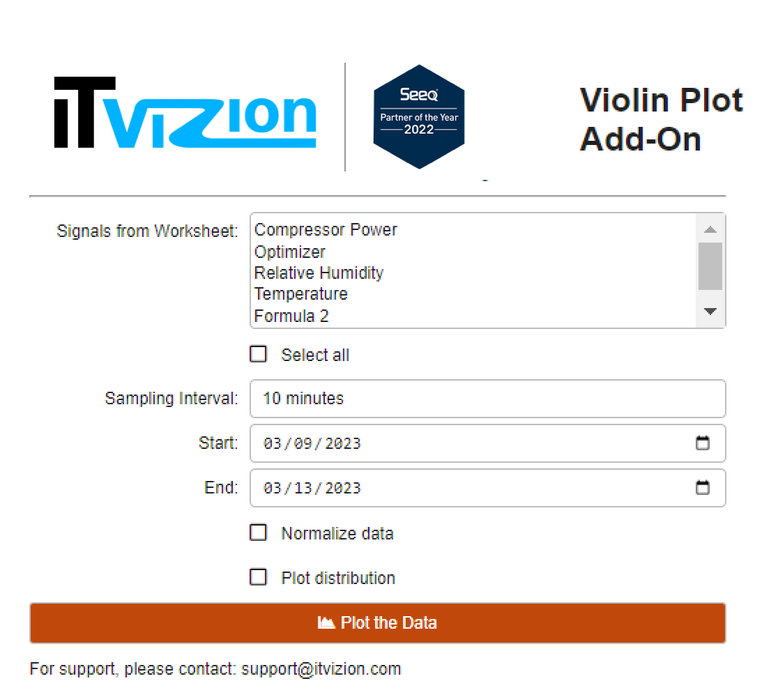 |
| Figure 1. User Interface of the Violin plot add-on. |
Furthermore, the “Sampling Interval” field provides for an interval to sample the signals’ data. The user can fill the field using a variety of options, from seconds, to days and months. Then, the start and end date of the data need to be selected.
Finally, the last two checkboxes provide for: - Normalize data: data of each signal are subtracted their mean and divided by their standard deviation in order to bring them to a scale that allows for plotting them together in the same figure. - Plot Distribution: histograms including their mean value are generated for each signal.
On the plot, the user can hover over the violin plot in order to access calculations such as the mean, standard deviation, kernel density estimation and other. The user will also be able to zoom in and out, hide signals, download the figures and more, using the buttons on the top right corner.
Lastly, a static line plot is generated for all the plots and shown at the bottom of the output.
Interactive Pairplot
The Pairplot_interactive class initializes an object that builds a GUI for an analysis worksheet provided through its URL. The GUI displays a pairplot of available signals and allows users to select signals, generate plots and colour by the desired string column.
Through the interface, the user has the ability to select multiple signals by holding the CTRL button and clicking or using the Shift button and keyboard arrows, or select all using the checkbox right below.
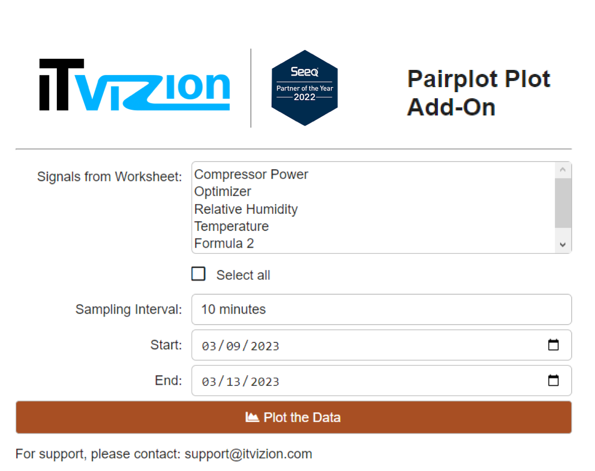 |
| Figure 2. User Interface of the Interactive Pairplot add-on. |
Furthermore, the “Sampling Interval” field provides for an interval to sample the signals’ data. The user can fill the field using a variety of options, from seconds, to days and months. Then, the start and end date of the data need to be selected.
After clicking the plotting button, if lexical expressions/string values are present in the data from the different signals, the add-on recognizes them and provides for a selection box that would colour the plot by the different values of the selected signal.
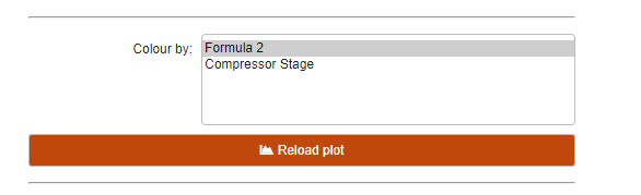 |
| Figure 3. Colour by option for string values. |
On the plot, the user can hover over the violin plot in order to access the values at selected points. The user will also be able to zoom in and out, hide signals, download the figures and more, using the buttons on the top right corner.
Static Pairplot
The Pairplot class initializes an object that builds a GUI for an analysis worksheet provided through its URL. The GUI displays a static pairplot and line plot of available signals and allows users to select signals, generate plots and colour by the desired string column.
Through the interface, the user has the ability to select multiple signals by holding the CTRL button and clicking or using the Shift button and keyboard arrows, or select all using the checkbox right below.
 |
| Figure 4. User Interface of the Static Pairplot add-on. |
Furthermore, the “Sampling Interval” field provides for an interval to sample the signals’ data. The user can fill the field using a variety of options, from seconds, to days and months. Then, the start and end date of the data need to be selected.
After clicking the plotting button, if lexical expressions/string values are present in the data from the different signals, the add-on recognizes them and provides for a selection box that would colour the plot by the different values of the selected signal.
|
| Figure 5. Colour by option for string values. |
Lastly, a static line plot is generated for all the plots and shown at the bottom of the output.